The Clock 4, Bigger than Ever (Part 3)

So the big part is finally coming. Let’s tell the story about how new The Clock 4 came to be.

2 years ago, I wanted to bring The Clock to iOS, but there was many challenges and I needed to overcome these challenges.

The first challenge being, The Clock is mainly a menu bar app, how to bring The Clock to an iPhone or an iPad without doing this kind of thing?

Don

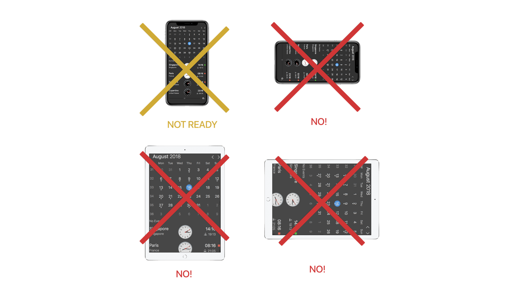
I wanted an iPhone/iPad full experience. Not a simple macOS port. You should be able to turn your iPhone and use the landscape view for something more, for something different. I definitely did not want the iPad view being a simple stretch of the iPhone portrait view. So as you can see many questions raised at the time.

The second challenge, I wanted to minimize the difference of code between macOS and iOS. The 2 platforms core development kits are similar but different enough to lead to a huge amount of works. So I needed to find a solution for this too.

These 2 challenges, took me time, before finding a solution which I think is today working well. Many trials and errors. Coding, designing, going back to the board and many back and forth. This was a big part of the first 6-8 months. Because I was never happy with my choices, I was maybe not ready to go all the way.

It is when I had to make a choice take the blue pill or the red pill 🤪

Matrix

So, you guess which one I took… Yes I went all the way down the rabbit hole.

My focus was to keep a familiar interface, as The Clock is used by tens of thousands of you on daily basis. While creating a complete new kind of “responsive app” which should react and adapt to any window or device size. And all being supported by Core Animation, Auto-Layout and other recent powerful Apple frameworks to leverage the best UI experiences.

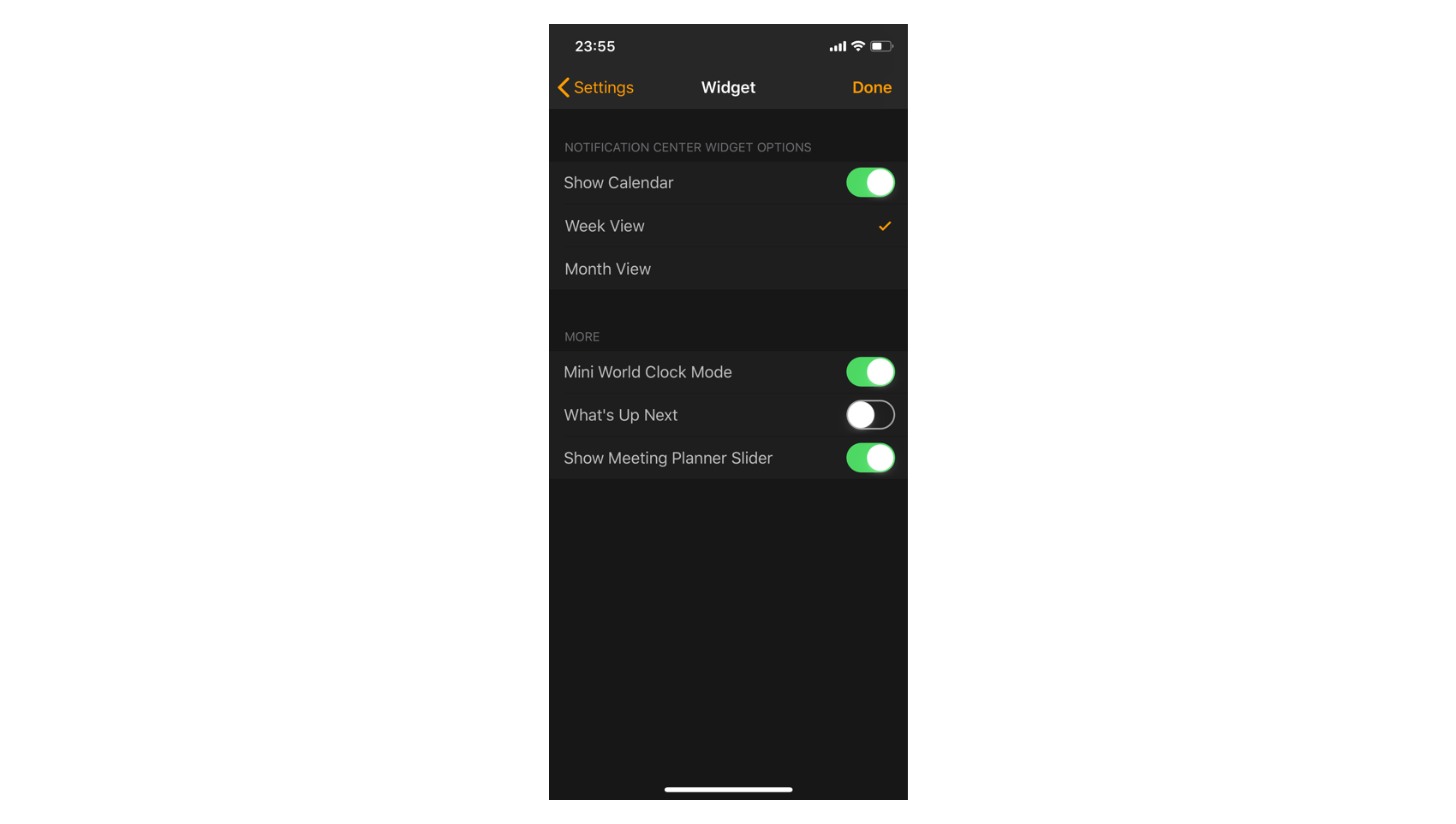
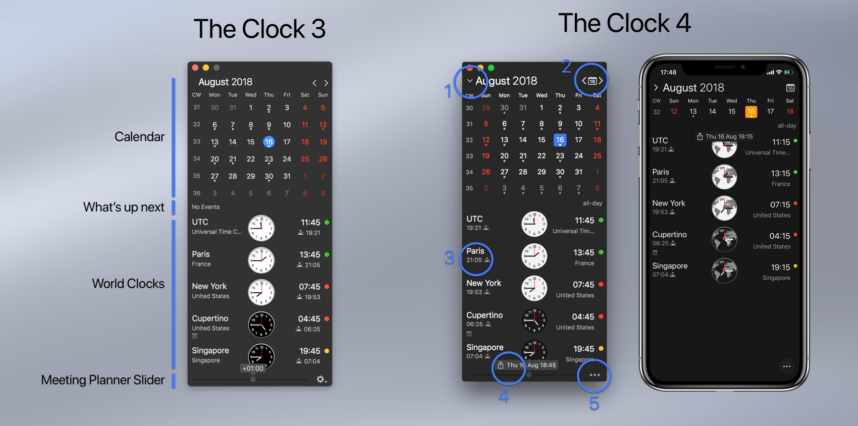
When I took this direction for the new The Clock 4, I realised that I had found a nice solution and that at the same time I could bring many features that customers wanted but could have never being incorporated in the previous versions, due to the static window size.

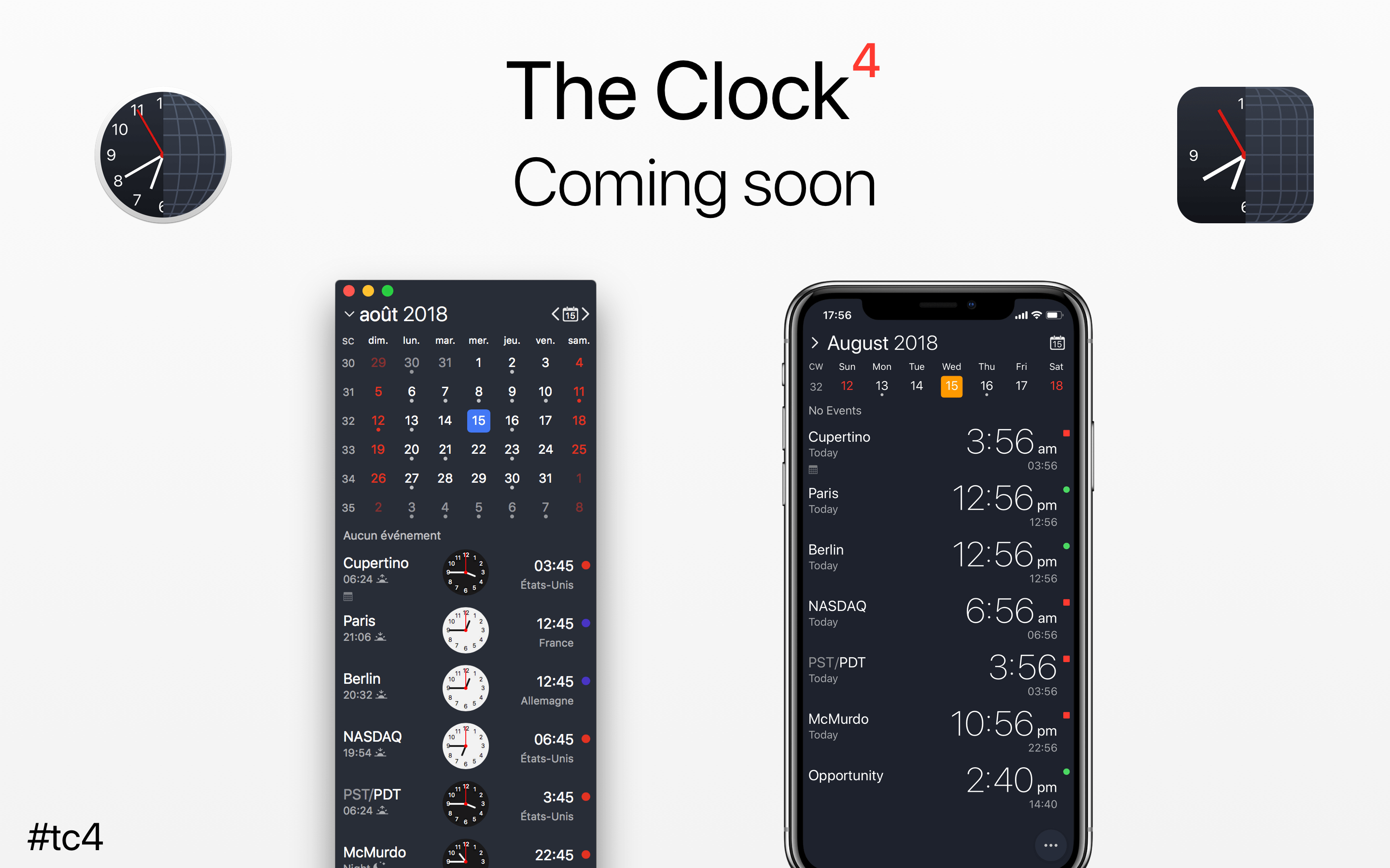
Here is a little video of the result. Hope you like it.

Few examples. As the design should react and adapt the any window size, this means that obviously you should be able to resize the window 😉.

  • Resizing the window will solve the issue of long city name.
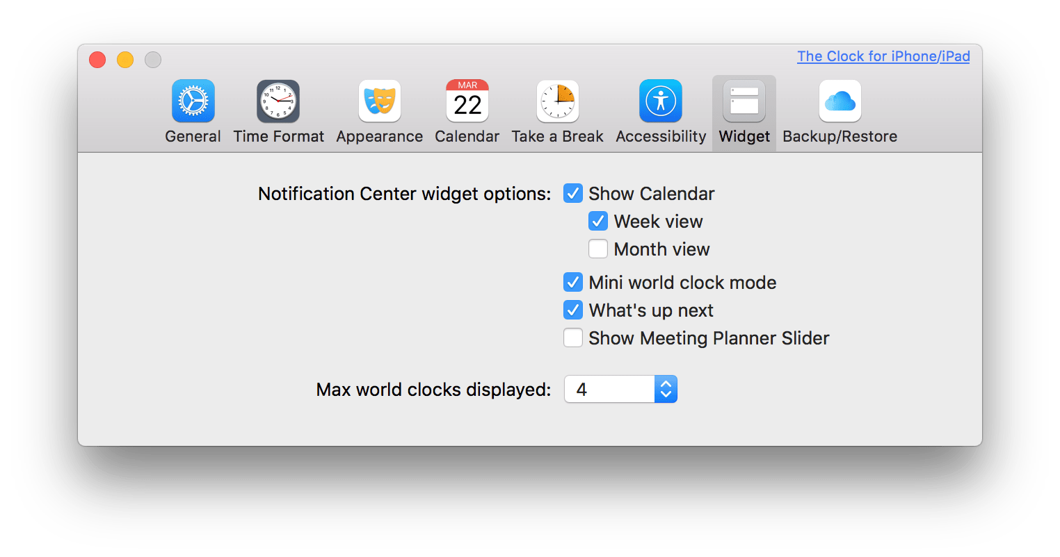
  • It means as well that I could implement a similar iOS Dynamic Type to the macOS.
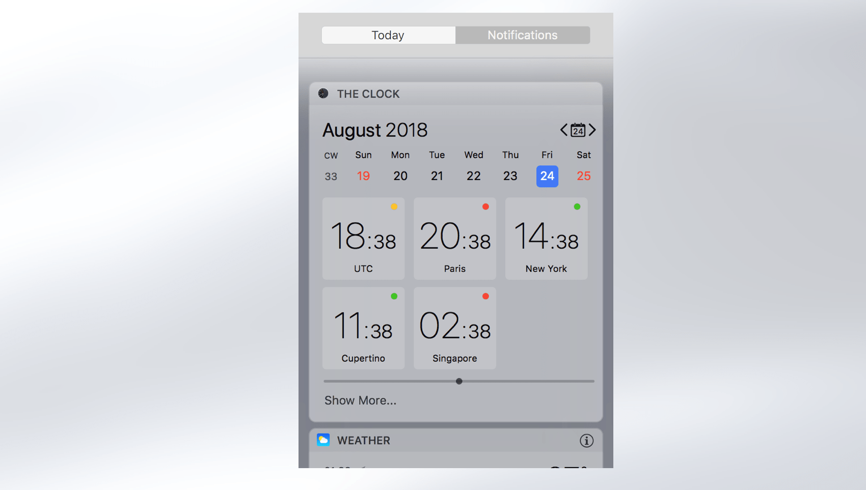
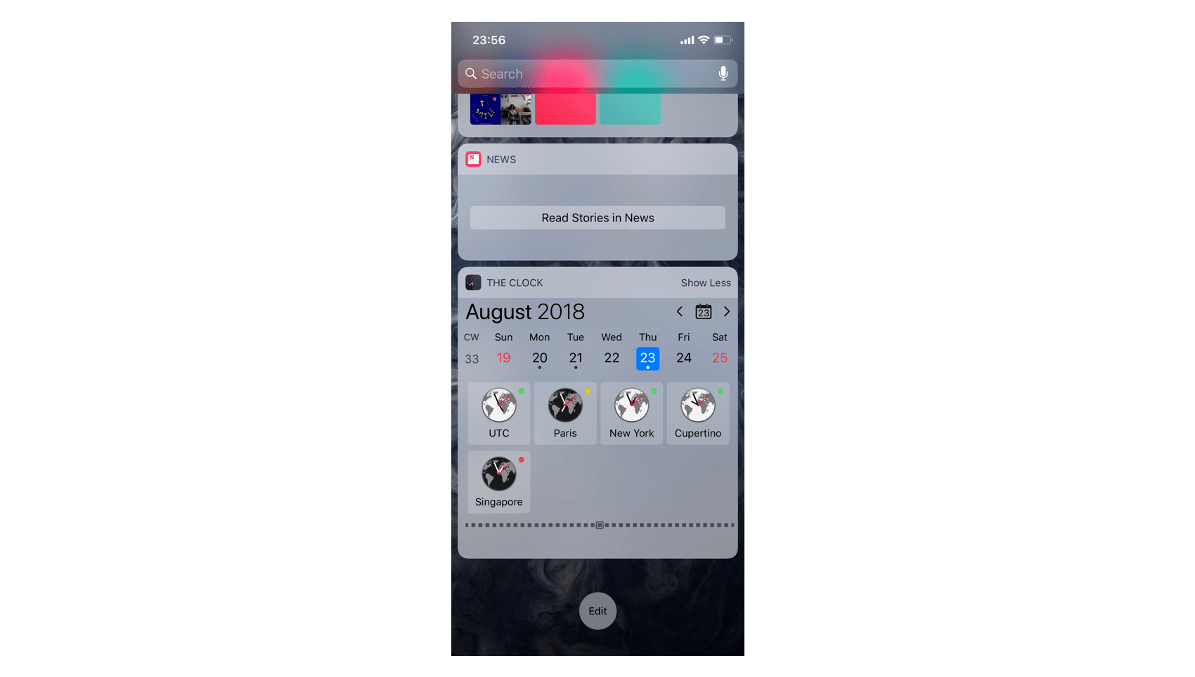
  • It means as well you could have a horizontal display of the world clocks. for the users having big external display and who want to see this kind of view.
  • It means that you can enjoy working with The Clock in a Split View or FullScreen.
  • It means I could create an additional extended meeting planner.

So yes The Clock 4 has in its core being designed fully responsive. This way it can gracefully adapt to any device size or any window size.

I always thought The Clock has being structured as a Russian Dolls. Meaning you have everything working when you open it, nothing to tweak or complicated.

Russian Dolls

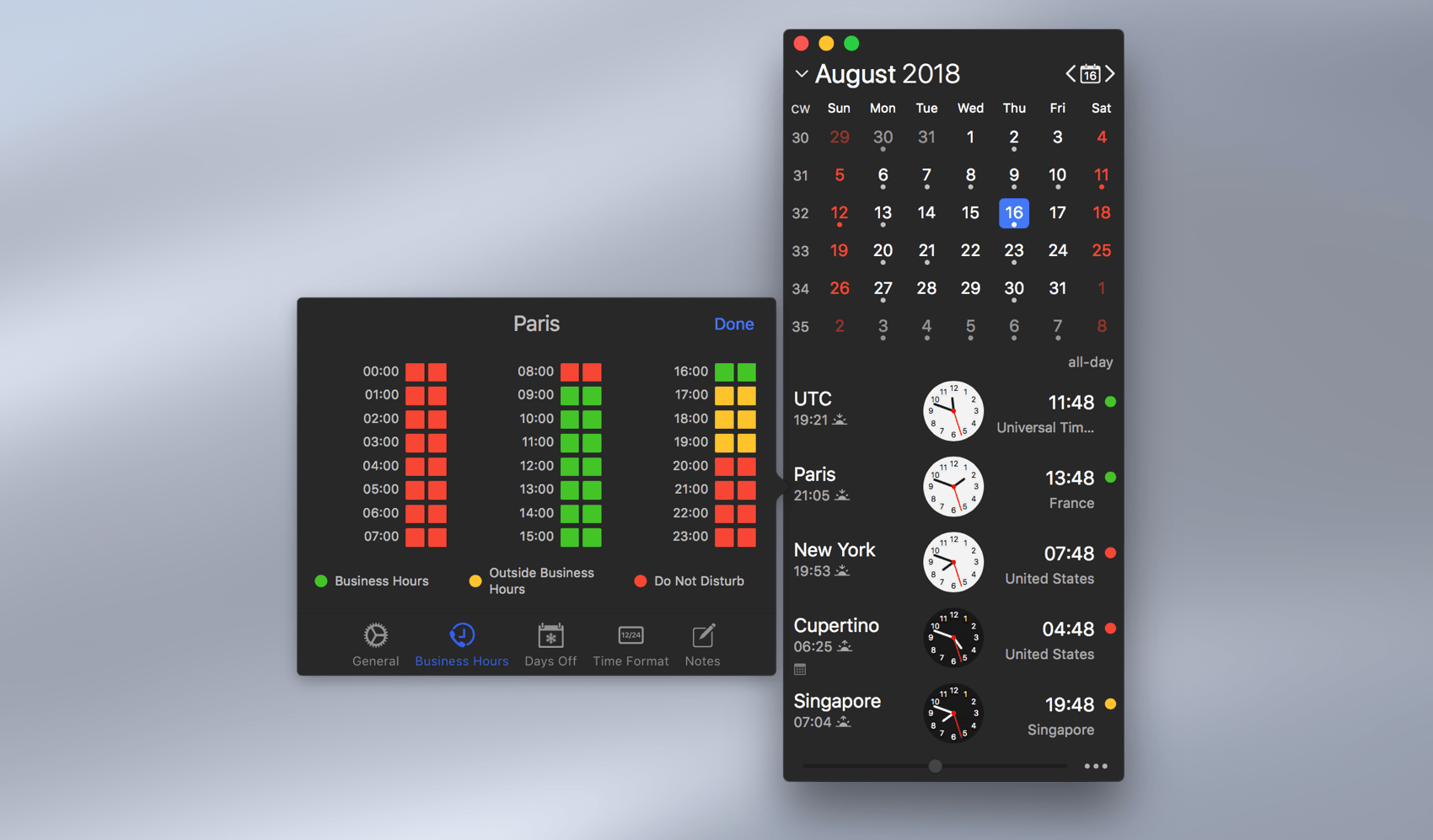
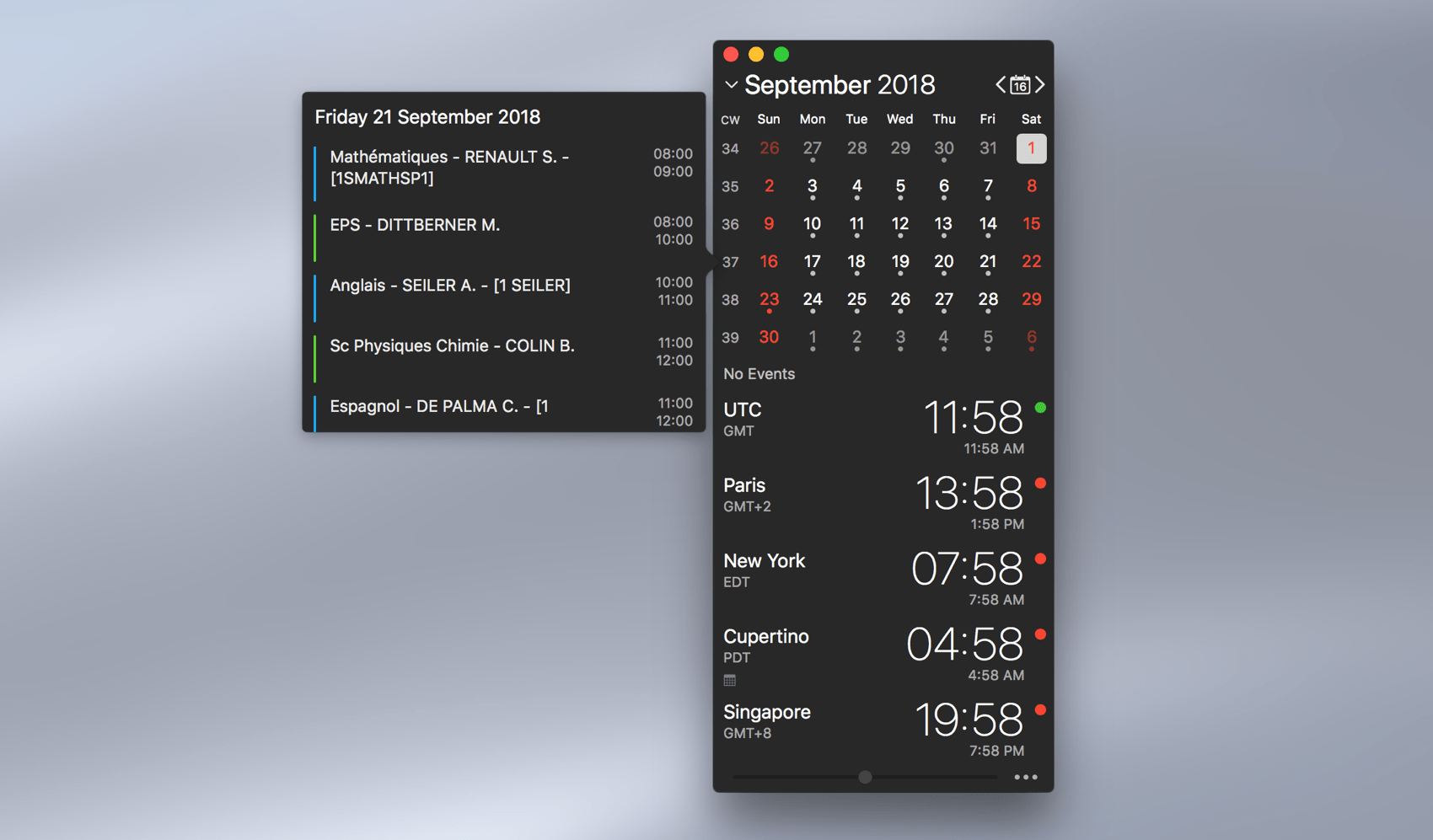
But if you want, you can go further and activate more features which are suitable to you. This new version bring the concept to a all new level.

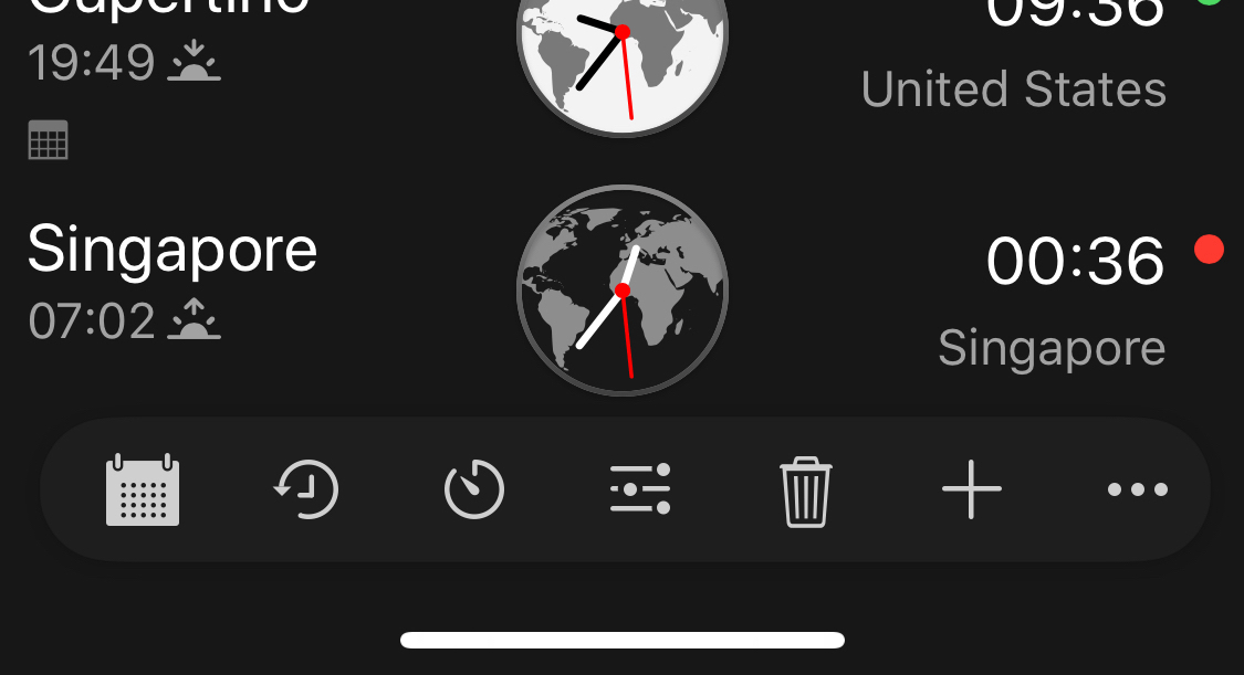
With of course a beautiful meeting planner for the Touchbar, where you can set your meeting, select the cities. Or simply quickly view the time of the different cities.

TouchBar

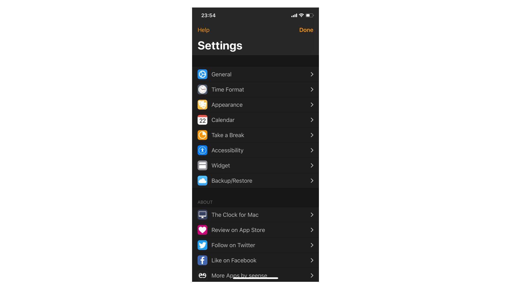
More in the last and final blog post next week.


The Clock 4, Bigger than Ever (Part 2)

Before to enter the big part (Part 3) of this blog series, I will show you for this second part some nice new goodies coming in The Clock 4.

The first features will be macOS only.

The Menu Bar date/time

One of the nice feature that users wanted for a while was the ability to define their own date and time format in the menubar. No more waiting. The Clock 4 in macOS is coming with this feature.

Custom format

Simply enter in the custom format any date/time with the RFC 3339 date/time format, and The Clock will display it.

Custom format

The Touch Bar

I wanted The Clock 4 to leverage this new interface provided in the recent MacBook Pros.
First, I had to buy one of those baby 🤪. I could have developped this part without buying one and tested it in a simulator, but I wanted to be able to experience properly the Touch Bar, in order to deliver the best experience for The Clock 4.

So here is what the main Touch Bar looks like

Main Touch Bar

As you can see you can access all the functions of The Clock.

  • Add World Clocks
  • Delete World Clocks
  • Show/Hide the different views
  • Directly turn ON/OFF the Take a Break feature
  • Set a meeting for the Meeting Planner
  • Look for dates and events

The idea being, you need to be able to control all the part of The Clock from the keyboard shortcuts and as well from the Touch Bar. With a strong emphasis on the Accessibility.

Touch Bar delete world clock

Touch Bar calendar

NB: The meeting planner will be shown in the next blog post as part of it is part of a big new feature.

Of course all the design of the icons are in line with the menu on the iPhone/iPad version, for a seamless experience accross devices.

iPhone/iPad menu

Notification Center Widget

The notification center widget was as well a long time request, and is finally coming too 😁😎.

Here under are what it looks like in macOS and iOS.

macOS Notification Center Widget

iOS Notification Center Widget

And of course as everything in The Clock you can fine tune what to display in the Notification Center.

macOS The Clock Widget Preferences

iOS The Clock Widget Preferences

BTW, as you can see below all the features are cross devices. 🧐😍🤪

iOS The Clock Preferences

Backup/Restore

Following my last blog post users asked me if iCloud was coming a long side with DropBox backup in this new release. Answer: Yes. Here is the new Backup/Restore interface.

macOS Backup/Restore

iOS Backup/Restore

These are few of the new goodies part of The Clock 4. I hope that you love what is coming. More to come in the next blog posts. The next one will be revealing the next “Big new thing” in The Clock 4…

Stay tuned for part 3.


The Clock 4, Bigger than Ever (Part 1)

After 2 years in the making The Clock 4 is finally here.

Over the next few days, I’m going to take you to a journey, unveiling the biggest update ever of The Clock, which leaded to The Clock 4.

I have a lot to cover. How much to cover you say? To give you an idea, The Clock 4 has around 100 optional settings to match your need.
Of course, I will not detail all of them, but I will unveil the major ones over the course of the next few days (~1 week). With at the end of this journey the release of the beta.

Before to describe all the redesign processes, struggles, issues, many times the rewrite of the code. In this first post, I will simply start slow. I will show the small UI differences between The Clock 3 and The Clock 4.

Big clarification before to start this journey. The Clock 4 refers to either the macOS version either the iOS version. As for a seamless experience, there is 99% features compatibility. Obviously not the menubar part 😉.

As you probably know The Clock is designed to be beautiful & simple yet a powerful productivity tool all at the same time.

Small Differences

The Clock is composed of 4 parts.

  • The Calendar.
  • What’s up next complication.
  • The World Clocks area.
  • The Meeting Planner Slider.

And these parts can be shown or hidden as per your need.

The Clock 4 of course retains this long time useful and loved UI, as you can see in the picture. But with small differences…

  • The themes have a better color contrast. The font differents sizing are more inline with what you could see with the iOS Dynamic Type font sizes. The selected day is now with a nice rounded square.
  • While the calendar is shown, you can now expand/collapse the calendar with 6 weeks (as before) or 1 week. Usuful for the smaller screens if you want still to see the calendar but do not want it to take too much space.
  • The Go to Today button action has now its own Today button with the current date displayed. Previously you had to click on the month 🙁
  • The world clocks complications (more than before) can now be placed on the left or right. The full complications list is avaiblable for both sides.
  • The meeting planner slider panel now display the date/time directly in the panel. And the panel now have a share button clearly shown, to share your meeting information. Previously you had to click to get the contextual menu. Which was maybe not obvious.
  • The gear button has been replaced by a “more” button for a consistent UI between macOS and iOS.

These are the major visual differences that you may notice when you open The Clock 4.

On the macOS version, you may not notice the following one…

Custom format

Yes, on macOS, in the menu bar, now you can set your own custom format!

A little bit more:

  • While panning to set a meeting, you are not limited anymore to +/- 24h. The Clock 4 will automatically continue and change the date in the calendar.
  • You may not have noticed, but you can now change the analog clock design.
  • And few other goodies such as the new redesigned World Clock settings for a consistent experience across your devices.

World Clock settings

  • Or the new redesigned calendar events.

Calendar Events

The World Clock settings and Calendar events are now shown with a double click/double tap, in order to better align the gesture between macOS and iOS for the display of a popover panels.

These are really only a tiny part of the nice updates coming to The Clock 4. Be reminded that these blog posts will run for ~1 week. So I have far more to cover about this Bigger than Ever release.

Oh! before I forget. All this nice UI has been completely rewritten and is now driven 100% by Core Animation and Auto Layout for smooth animations and optimum rendering 🤪. And is macOS 10.14 Mojave and iOS 12 ready.

Little Game: A visual detail of The Clock 3/The Clock 4 macOS first screenshot has not been described yet, and it is a major one. Can you spot the differences between The Clock 3 and The Clock 4 macOS and tell me which one? 🤔.

Part 2 post to follow soon…


seense news, long overdue status update ;)

Yes, it has been a long time since my last post 😉 I feel like it is an overdue. If you were wondering when seense lovely app are going to receive major updates, do not worry more…

After 20 years in the Telecom Business, travelling the world, as Chief Technical Officer consultant, my heart sent me a warning, 2 years ago, that it was time to change something. So after a little surgery it was time to think about the future.

So what could I do? After 20 years in the same business, I thought it could be good to try something else. To challenge myself professionally, to have less traveling, and to be, at the same time, closer to my kids.

seense, my hobby, is running nicely with thousands of customers enjoying my apps every day, and this since many years. But seense was not making near enough money to be sustainable and to provide for my kids (going soon to university). But the seense path was an interesting one. It was time to investigate further this path.

So basically I spent the last 2 years to transform my hobby into a business, to be able to live from it. As of today I’m on track with my objectives. So the world of software become as of today my sole source of revenue. Let’s make everything to continue on this new adventure that I love. I will give you more details on what seense has become sometime in the future.

Another big part of the last 2 years was to work on the next major update of The Clock and at the same time to lay the foundation for the other apps update such as MenuBar Stats and more. I will give you more info about this part in my next blog post coming in the next few days. As it is a big one, it will need it’s own blog post…

But just a tease… It is so big of an update, that for the first time in 7 years of The Clock updates, I will need to run a really strong beta, as for the first time The Clock has been re-written to be on macOS and on iOS.

The Clock 4, coming soon

Stay tuned…